Eight training games I designed and built, a mission-control hub, and a first-time learner experience for cyber ranges. Below is real gameplay, working prototypes, and the UX and game design thinking behind every decision.
Open to senior product design and UX roles on cyber training products. Based in Greater Montreal, working remotely with teams worldwide.
EIGHT GAMES I DESIGNED AND BUILT · REAL GAMEPLAY · PICK ONE
The design question
How do you get a learner to practice a security skill, not just read about it, in the five minutes they actually have?
My focus
Game design, UX and UI, and front-end build. I take a learning objective, find the mechanic that is the skill, and build it to embed in a training platform.
About the examples
My own games and prototypes, shown under neutral branding with sample content. The footage is recorded from working builds.
MY GAMES / DESIGNED AND BUILT BY ME
Eight training games, each playable from briefing to debrief.
I designed these and built them with AI-assisted tooling. Every one has authored scenarios, an explanation for each important mistake, and a test suite that proves the lazy strategy loses: 209 tests across the eight, all passing.
8 gamesin eight different genres
209 testscovering the learning rules of every game
3 to 5 minper session, with a debrief that explains the result
No backendeach game is a static page that embeds in a course
Real gameplay: a decision, a mistake, the game’s explanation, the fix · Press play to load
MY GAME 01 / ISOMETRIC STRATEGY
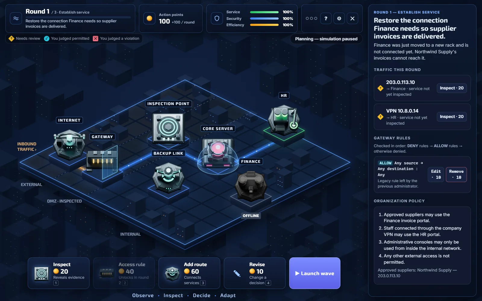
Network Defense: Keep Finance Online
Teaches: how routes and dependencies keep a service up, how to read evidence, and how to write an access rule that stops the attacker without stopping the business.
Real content from the game
“Source 198.51.100.23 is not on any approved list and is outside the company network.” “Destination: Finance — Remote desktop admin (RDP 3389).” “Pattern: repeated sign-in attempts, each with a different username.”
What it says after a mistake
“You connected Finance straight to the Gateway. Invoices reached Finance, but Finance couldn’t reach its database on the Core server, so each one failed. Services depend on other services — a path from the internet isn’t enough.”
How it is scored
40% service delivered, 40% prohibited activity denied, 20% efficiency. Two reasoning checkpoints and the final challenge are recorded separately as learning evidence.
Proved by tests
“Blanket blocking cannot earn the best result” and “backup routes preserve the access policy”, each checked on 8 seeds. 32 tests.
Why it sticks
The learner watches a rule succeed or fail on live traffic, so cause and effect are remembered together. Firewall and access rules, taught through consequences.
Real gameplay: a decision, a mistake, the game’s explanation, the fix · Press play to load
MY GAME 02 / TIMED INBOX DRILL
Phishing Speed Drill: The Payroll Request
Teaches: reading the sender, the reply-to and the real link destination, backing a call with evidence, and knowing when only a phone check can settle it.
Real content from the game
helpdesk@acme.example.it-notices.example “A domain is read from the right. This address belongs to it-notices.example; ‘acme.example’ is only a label in front of it.”
What it says after a mistake
“This was a real payslip notice. External mail and a generic greeting are not evidence by themselves; the domain, link, and timing all matched. False alarms slow down real work.”
How it is scored
100 for the best response, +20 per strong cue cited, a streak bonus, and a speed bonus that only counts after a correct decision. A false alarm scores zero.
Proved by tests
Always-report, always-safe and always-verify each “stay out of the top two ratings”. “Slow but correct play still earns the top rating.” 53 tests.
Why it sticks
Citing the evidence before deciding builds the habit of looking, not guessing. Awareness training for every employee, not only analysts.
Real gameplay: a decision, a mistake, the game’s explanation, the fix · Press play to load
MY GAME 03 / ALERT TRIAGE BOARD
Incident Triage Race: The Busy Morning
Teaches: setting priority from evidence and business impact, linking alerts that are one incident, and revising when new facts arrive.
Real content from the game
A new device on an account that “approves outgoing payments”. “The quietest alert in the queue turns out to be an attacker with a working sign-in on the payments portal. Business impact, not the severity tag, sets the urgency.”
What it says after a mistake
“The severity tag says so.”
How it is scored
Points for the best or a defensible lane, a matching reason, revising on new evidence and correct links. Missed criticals and needless escalations cost points. Time is reported separately.
Proved by tests
“Never treats the severity tag as a valid justification.” “Rewards revising when evidence changes, not standing still.” 13 tests.
Why it sticks
Being wrong about the quiet alert, then seeing why, is the lesson people repeat to colleagues. A natural team game for workshops and live events.
Real gameplay: a decision, a mistake, the game’s explanation, the fix · Press play to load
MY GAME 04 / SOC INVESTIGATION CASE
SOC Dashboard Challenge: A Strange Login
Teaches: separating evidence that discriminates between explanations from evidence that fits both, and responding in proportion while data is leaving.
“You had strong evidence that this was approved work and contained anyway. The business paid for an interruption the evidence did not support.”
How it is scored
Outcome 40, decisions 36, reasoning 24. “Each call is judged on what you knew at the time, not on how the case turned out.”
Proved by tests
“No single blind opening wins in both variants.” “Investigating first is not always right: delay lets the incident progress.” 13 tests.
Why it sticks
Two truths with the same opening teach that the right call comes from evidence, not from matching a familiar story. A warm-up before a hands-on investigation lab.
Real gameplay: a decision, a mistake, the game’s explanation, the fix · Press play to load
MY GAME 05 / DISPATCHER DESK
Cyber Dispatch: First Shift
Teaches: asking the questions that matter, giving the safe next step before harm lands, and handing off only what the evidence confirms.
Real content from the game
“Hi! I just got an MFA prompt but I’m not signing in right now. I’m at my desk. Is this legit?” Asking reveals: “The prompt shows a Mail sign-in from Rotterdam. She is in the Lisbon office.”
What it says after a mistake
“Reply to the email and ask them to confirm the new details.” → “The sender ‘confirmed’ their own request, and Elena queued the payment.”
How it is scored
Four parts of 25 per report: evidence gathered, priority, guidance and handoff. Response time is shown but kept out of the score.
Proved by tests
“Escalating everything as high scores poorly.” “Asking every question before acting is not the best run.” 24 tests.
Why it sticks
Recoverable harm: the learner sees the damage a bad instruction causes, then gets to put it right. First response and handoff, for help desks and non-specialists.
Real gameplay: a decision, a mistake, the game’s explanation, the fix · Press play to load
MY GAME 06 / SQL INVESTIGATION
Query Hunt: Unusual Access
Teaches: filtering, aggregating and joining real log tables, reading the result correctly, and telling a suspicious observation from a confirmed conclusion.
Real content from the game
SELECT account_id, COUNT(*) AS attempts FROM logins WHERE result = 'failure' … GROUP BY account_id ORDER BY attempts DESC
What it says after a mistake
“Repeated failed logins alone do not establish compromise: they show attempts. Which evidence shows what happened after them?”
How it is scored
Out of 1,000: correct results, evidence cards, interpretation and conclusion. A right conclusion without its evidence scores zero. Hints are counted, never deducted.
Proved by tests
“Accepts equivalent queries written differently.” “Never grants evidence for running a query.” Real SQLite runs in the tests. 31 tests.
Why it sticks
Writing the query is retrieval practice. Being stopped from over-claiming teaches analytic discipline. Log analysis practice with real SQL in the browser.
Real gameplay: a decision, a mistake, the game’s explanation, the fix · Press play to load
MY GAME 07 / ARCADE FLIGHT
Cloud Command: First Orbit
Teaches: finding the real capacity constraint through a dependency, balancing availability against cost, least privilege, and who is responsible for what on IaaS.
Real content from the game
“Serve at least 99% of checkout requests at the peak.” “Keep 10% headroom above the expected peak on every service in the request path.” “Cost ceiling: 120 credits for the 2-hour surge window.”
What it says after a mistake
Checkout “has enough capacity, but each request calls” the Payments API, “which can serve only” 1,200 rps. More checkout instances “cannot help until” it has capacity.
How it is scored
Continuity 35%, policy 30%, resources 15%, justification 20%. A failed access review marks the security objective failed whatever the score.
Proved by tests
“Adding capacity helps only where capacity is the constraint.” “Does not let a high score hide a failed security objective.” 18 tests.
Why it sticks
The numbers in the feedback come from the simulation, so the explanation matches exactly what the learner did. Cloud fundamentals in a lighter, arcade style.
Real gameplay: a decision, a mistake, the game’s explanation, the fix · Press play to load
MY GAME 08 / ACCESS GRAPH PUZZLE
Privilege Path Puzzle: Who Can Read Payroll
Teaches: tracing nested groups and inherited grants to find every route to a file, then making the smallest change that closes it without breaking business access.
Real content from the game
“An engineer opened a payroll file. Nobody remembers giving them access.” Hidden in the graph: “Added during a payroll deadline two years ago so Finance could get in quickly.”
What it says after a mistake
“Signing in is authentication: it proves who Alex is. What Alex may open is authorization, and that came from a grant.”
How it is scored
100 for solving, a bonus for matching the minimum number of changes, points for correct predictions, and 40 for explaining it right first time.
Proved by tests
“Never treats connectivity as authorization.” Each puzzle “cannot be solved with fewer changes than par” and “fails when access is removed for everyone”. 25 tests.
Why it sticks
Predict, test, then explain: the learner commits to an answer before seeing the result. Identity and access reasoning as a visual puzzle.
PLAY ONE NOW
Keep Finance Online
A network defense game you can play right here. Inspect traffic, write the access rules, and keep the service up. Three rounds, about five minutes, then a debrief that replays your decisions.
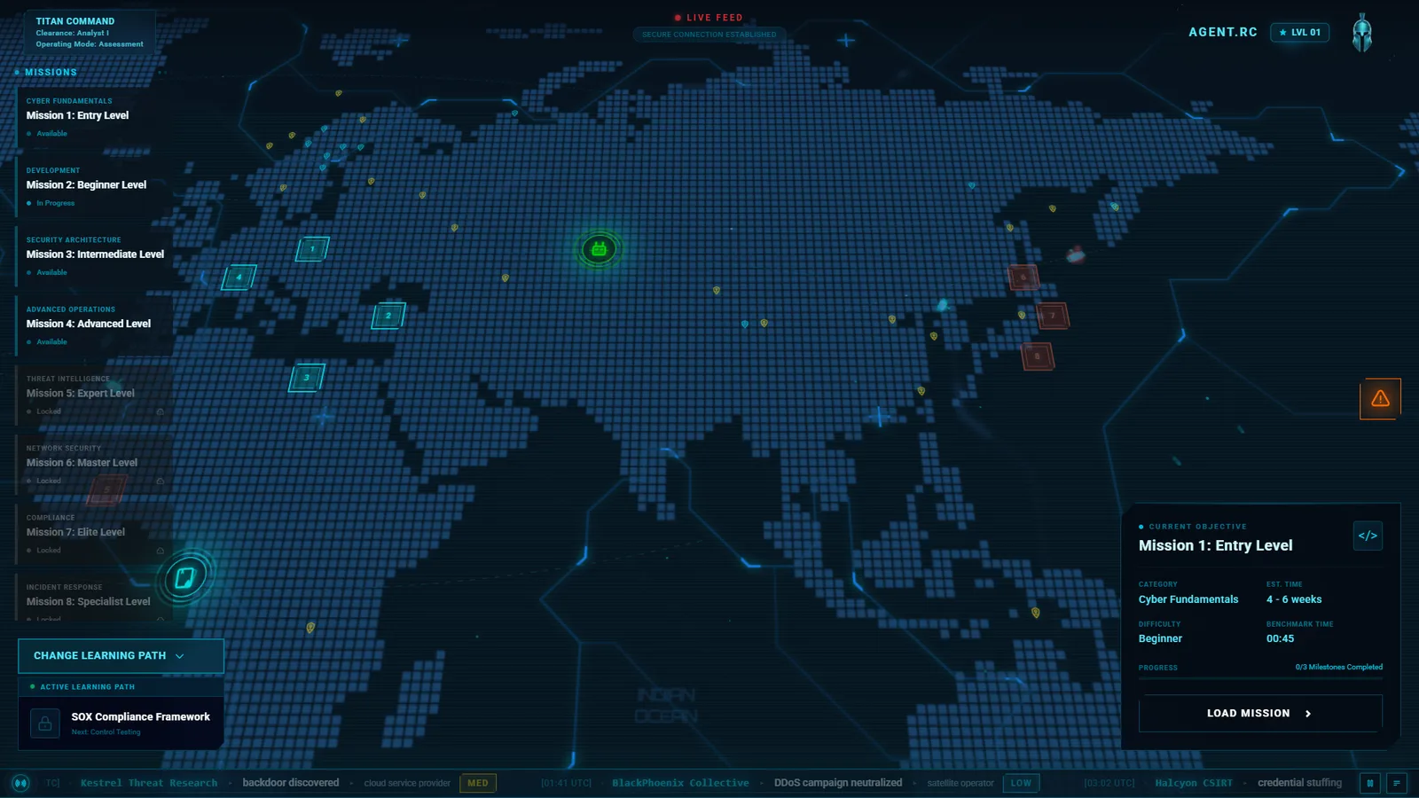
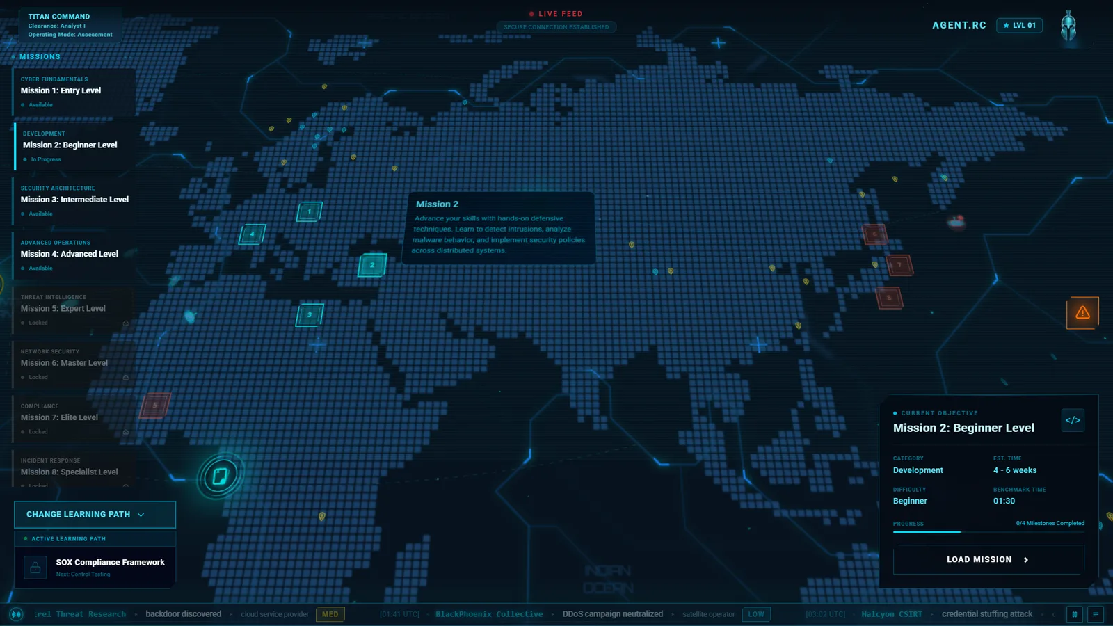
Mission Control: one screen that always answers “what do I do next?”
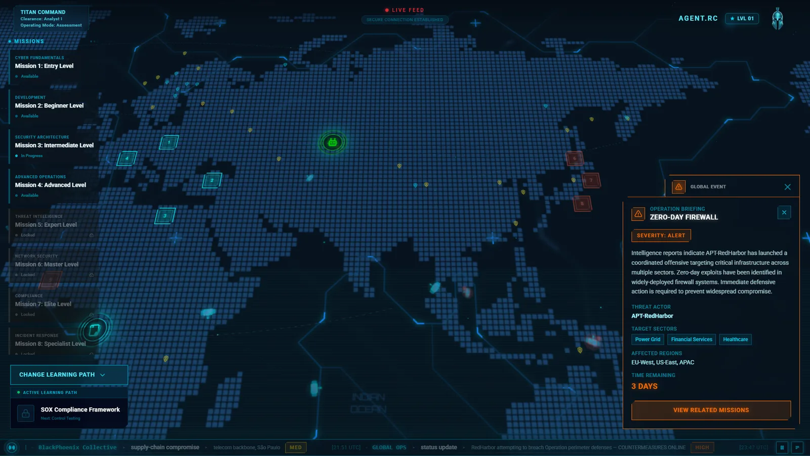
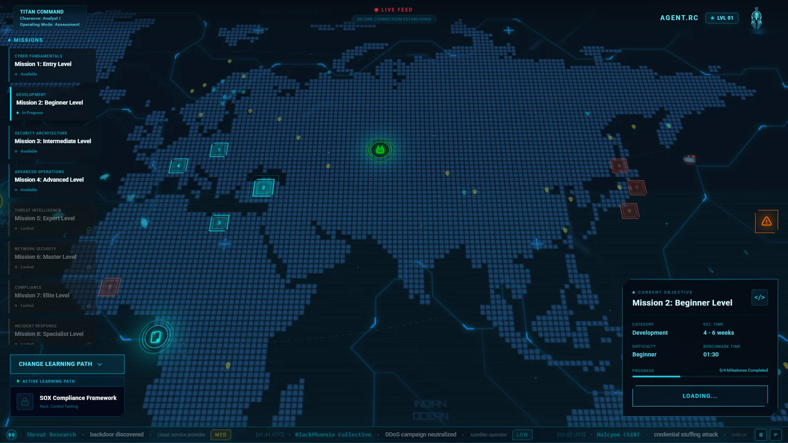
An early prototype of mine for the home screen of a gamified cyber training platform. I designed it and built it as a working front end, so every interaction below can be tried, not just described.
A learner logs in with twenty minutes to spare. How do they see where they are, pick the next mission, and start it, without reading a manual or getting lost in features?
My role
UX and UI design, game systems design, and the front-end prototype. Screens, states, motion, and copy are mine, along with the design specs for ranks, level-ups, and the debrief.
How it is built
React, TypeScript, Vite, and Tailwind. The map is plain DOM with CSS 3D: four layers at different depths give parallax as the camera moves, with no canvas or game engine.
The UX thinking
UX 01 / HIERARCHY
Three layers: what to do, who you are, what is happening.
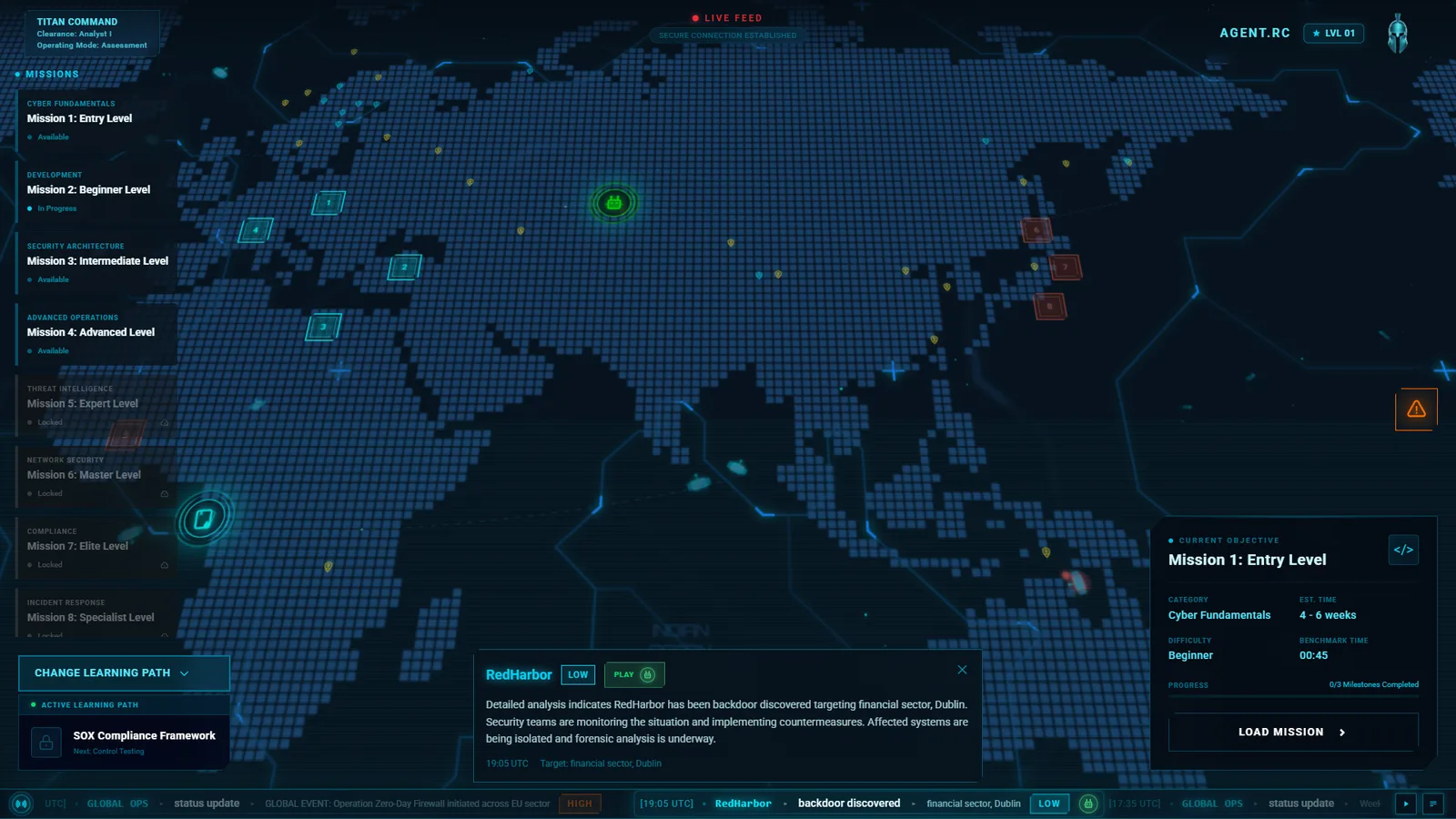
A mission hub can drown a learner in status. I sorted every element into one of three layers and gave each a fixed place, so the eye learns the screen once.
Primary: the mission list, the numbered markers on the map, and the current objective card with its one button.
Secondary: identity and level, the active operation, and the control to change learning path.
Ambient: the live ticker, global events, satellites, and vessels. They make the world feel alive and never ask for a decision.
UX 02 / ONBOARDING
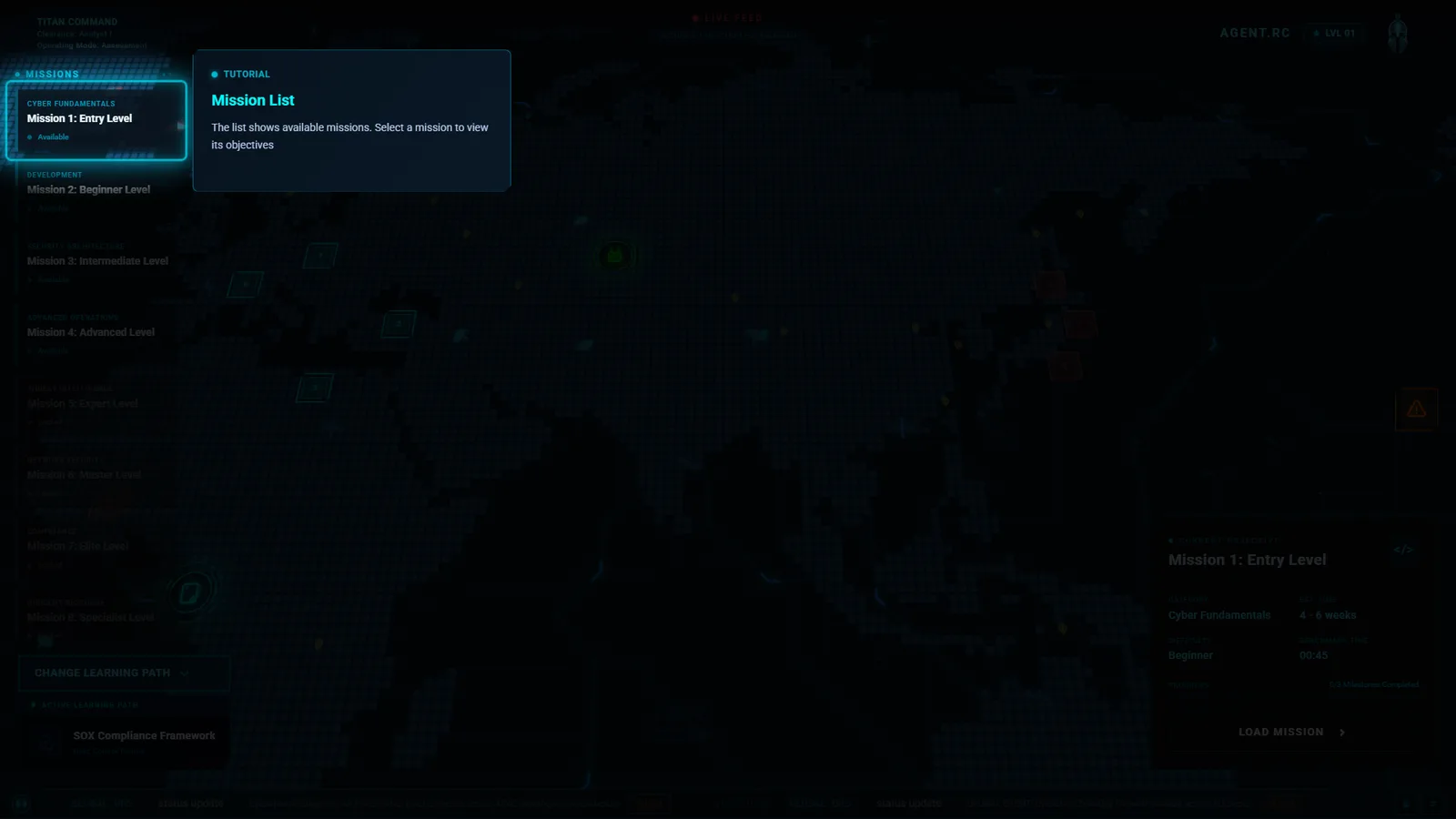
Say the one thing that matters, then get out of the way.
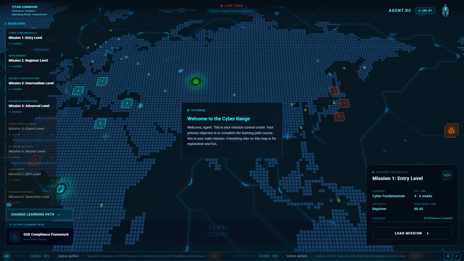
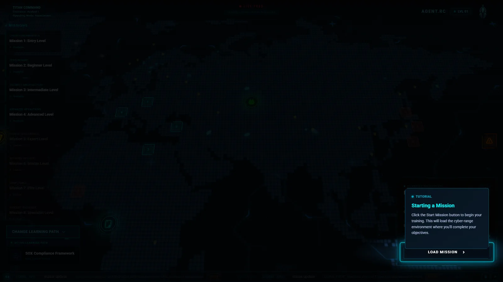
The first-run tutorial is three steps. It tells the learner that the learning path is the main mission and everything else on the map is optional, then spotlights the first mission and the button that starts it.
The learner completes each step by doing it, not by pressing Next. A wrong click shakes the hint instead of blocking.
The map stays live behind the dimmed overlay, so the tutorial teaches the real screen, not a slideshow.
A longer eight-step tour is available on demand for learners who want it.
UX 03 / THE CALL TO ACTION
One button that always tells the truth.
Starting a mission spins up a live environment, which takes time and can fail. I put that whole process into a single button whose label is the state, so there is never a second place to look.
Idle, loading, ready, continue: four labels on the same control, with progress shown inside it.
A long press during loading aborts, with a fill bar that shows the hold. Rapid repeat clicks are caught and explained.
Locked missions say why they are locked. Hovering a mission eases the camera to its marker and cross-fades the objective card.
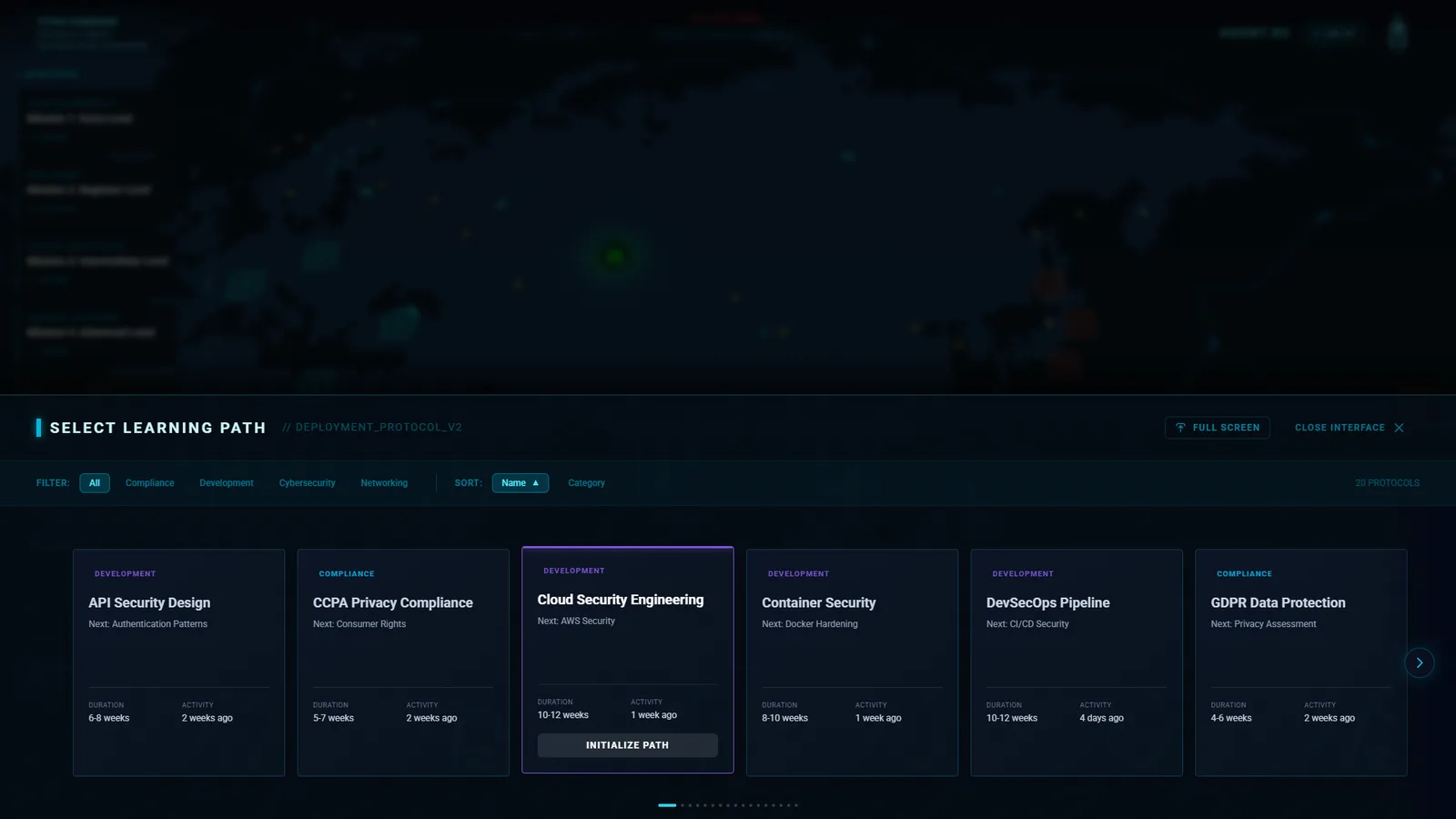
UX 04 / CHOOSING A PATH
Compare twenty paths without leaving the map.
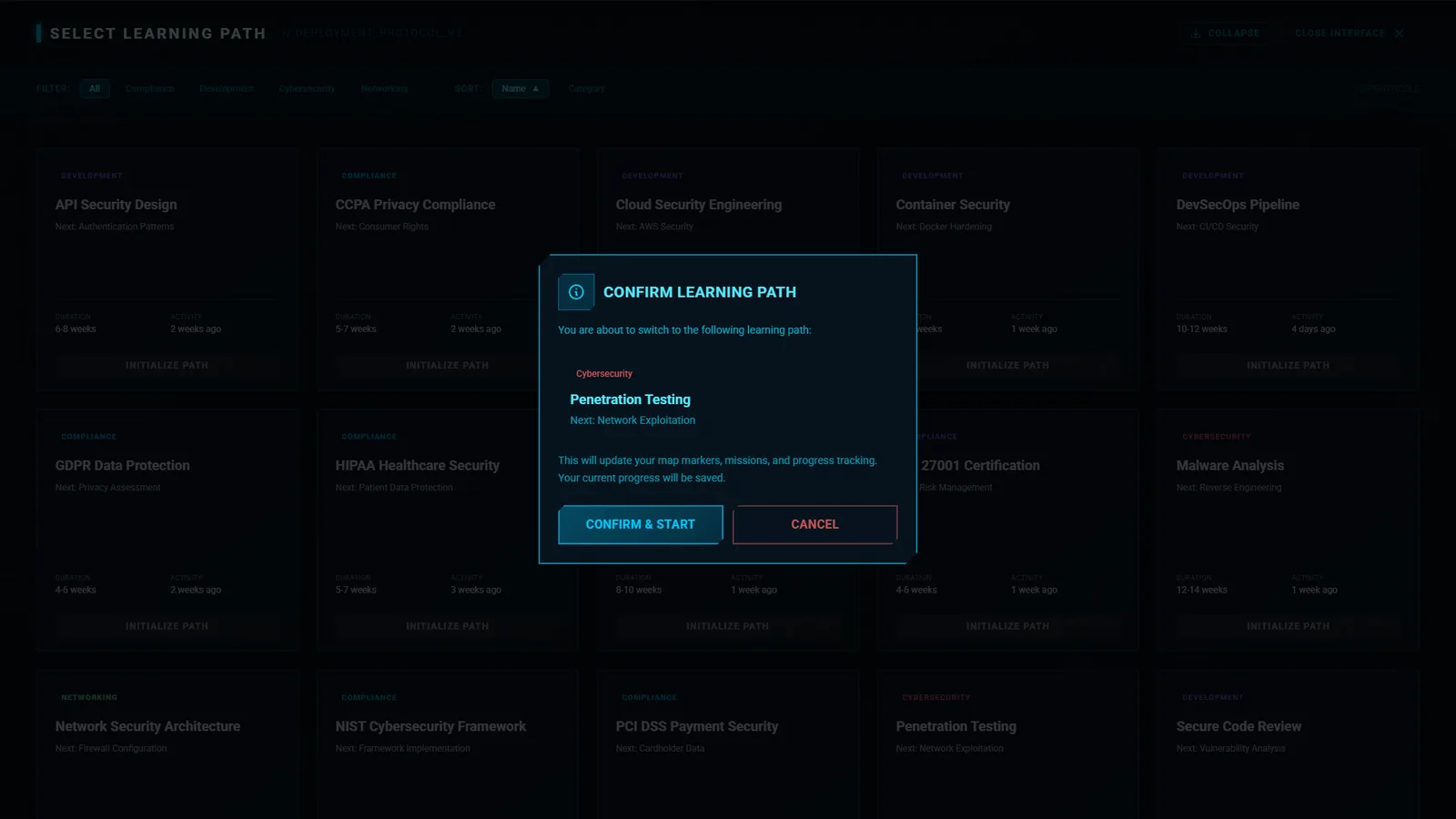
Changing learning path is a big decision that should feel reversible. The selector opens as a sheet over the map, with a full-screen grid for people who want to browse.
Filter by category, sort by name, move with arrow keys, close with Escape.
Each card shows duration and last activity before any commitment.
A confirm step says exactly what will change and that current progress is saved.
UX 05 / INTO THE WORK
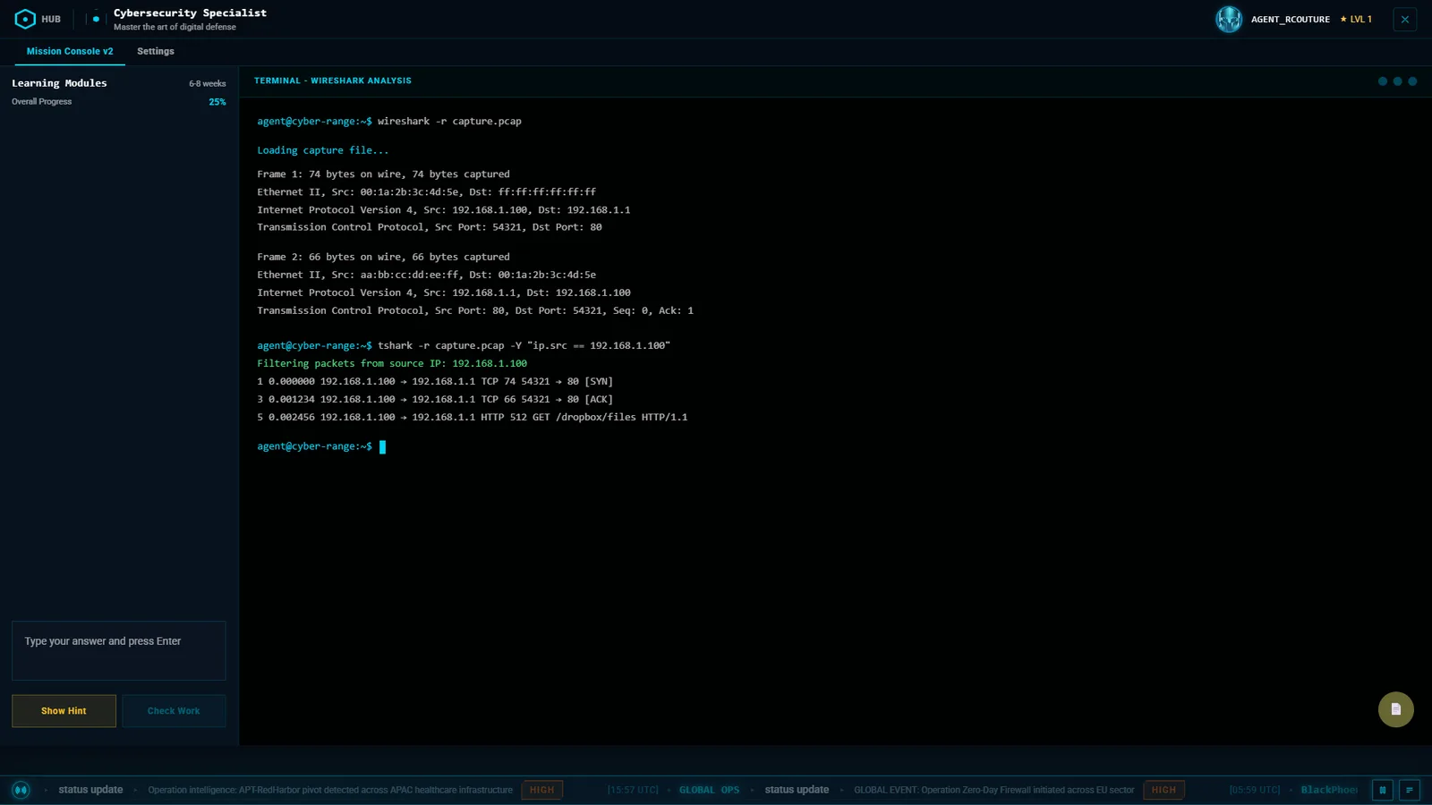
From the map to the keyboard in two clicks.
The mission console keeps the task, the progress, and the terminal on one screen, so the learner never tabs away to remember what they were asked.
Learning modules and overall progress on a left rail, the answer box and hint under it.
The terminal takes the rest of the screen. The world ticker stays at the bottom for continuity with the hub.
The console spec covers four exercise types, a timer with a five-minute warning, and hints that cost points.
The game design thinking
GAME DESIGN 01 / PROGRESSION
Two tracks: how far you have come, and what you are good at.
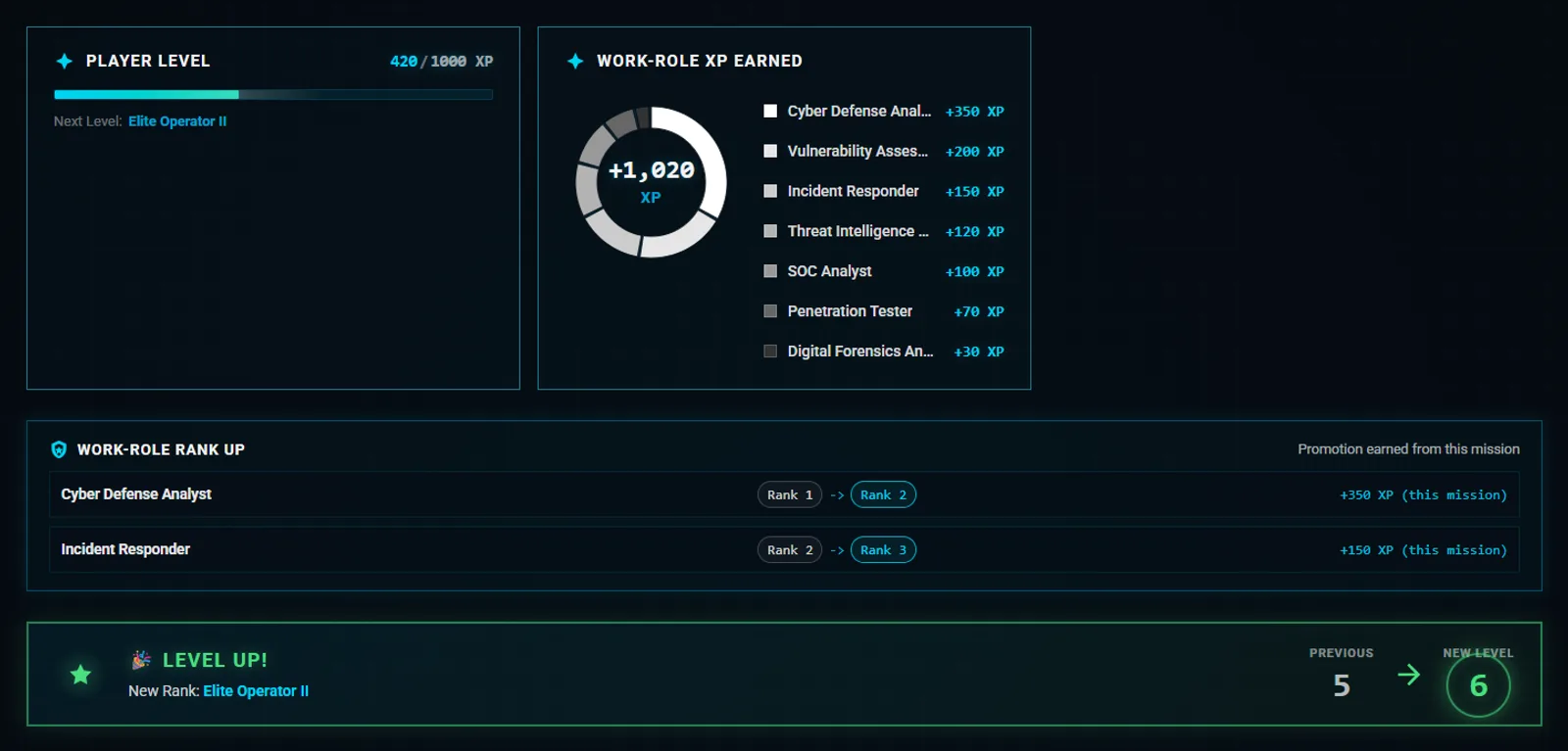
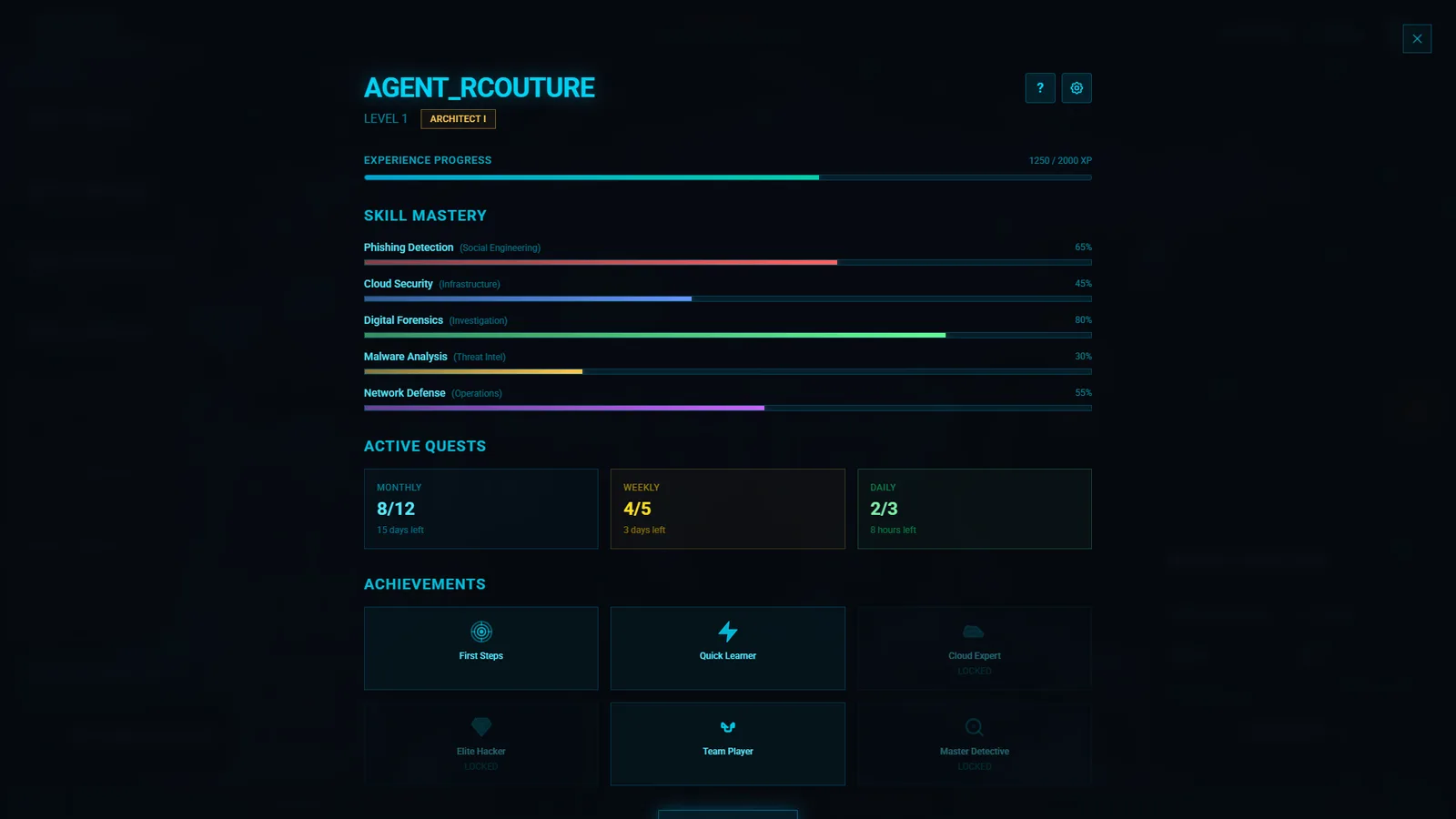
A single XP bar tells a security team nothing. I split progress into a player level for motivation and work-role XP for meaning, so one mission can advance a learner as a Cyber Defense Analyst and as an Incident Responder at the same time.
Ten player levels on a rising XP curve, from 1,000 XP for level 2 to 27,000 for level 10.
Work-role XP is shown as a breakdown per role, with rank-ups listed only when a rank actually changed.
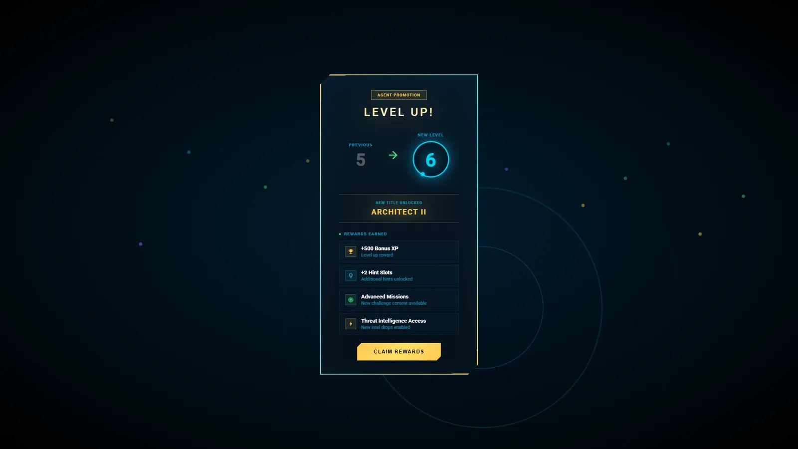
Celebrations are additive, not disruptive: inline, about three seconds, skippable, and never a full-screen takeover.
Design spec
GAME DESIGN 02 / RANK LADDER
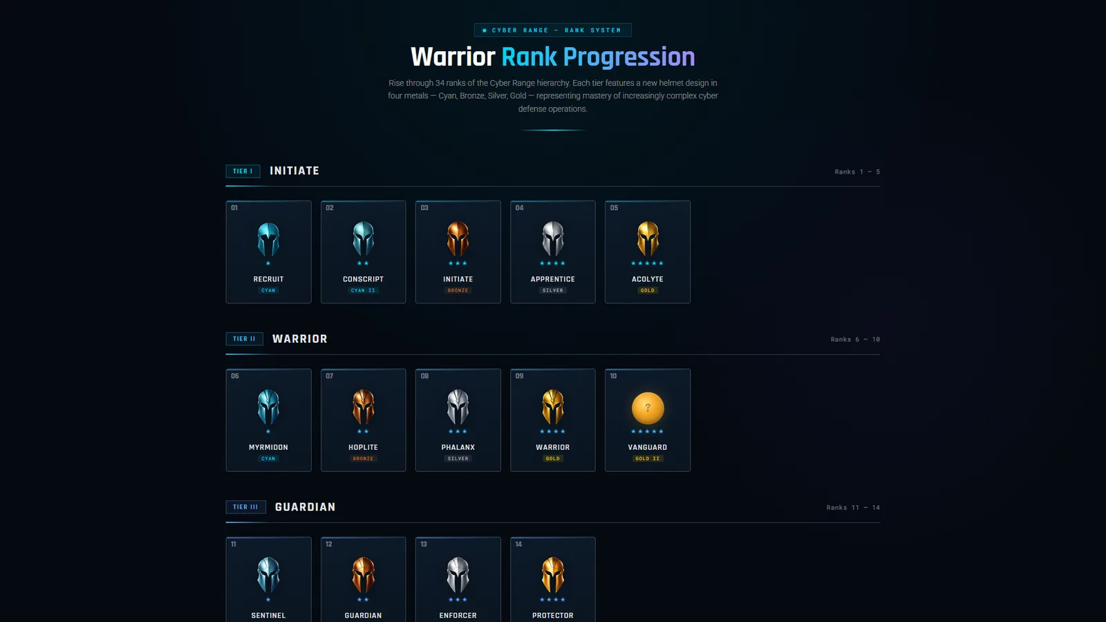
Thirty-four ranks a learner can read at a glance.
Long ladders fail when rank 17 looks like rank 18. Each of the eight tiers gets a new helmet silhouette, each rank inside a tier steps through four metals, and stars count position, so shape, color, and number all say the same thing.
Eight tiers, from Initiate to Legendary.
Four metals inside each tier: cyan, bronze, silver, gold.
Readable at avatar size, which is where a rank is seen most.
GAME DESIGN 03 / A LIVING WORLD
Give people a reason to look at the map again tomorrow.
A static hub gets ignored after the first week. Timed operations, global events, and a live feed make the map change between visits, and each one leads back to training.
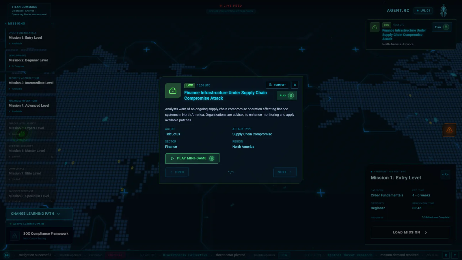
A weekly operation with a narrative, a threat actor, affected sectors, and a countdown, linked to related missions.
Event cards arrive a few at a time, dismiss themselves, and can be switched off for learners who want quiet.
A scrolling feed with severity chips that pauses on hover and expands on click or keyboard.
GAME DESIGN 04 / OPTIONAL PLAY
Side games that reward curiosity without derailing the course.
Exploration is labelled as exploration. Quick games live on the map and in the feed for learners who want a break that still exercises a skill, and they pay small XP so they never beat doing the mission.
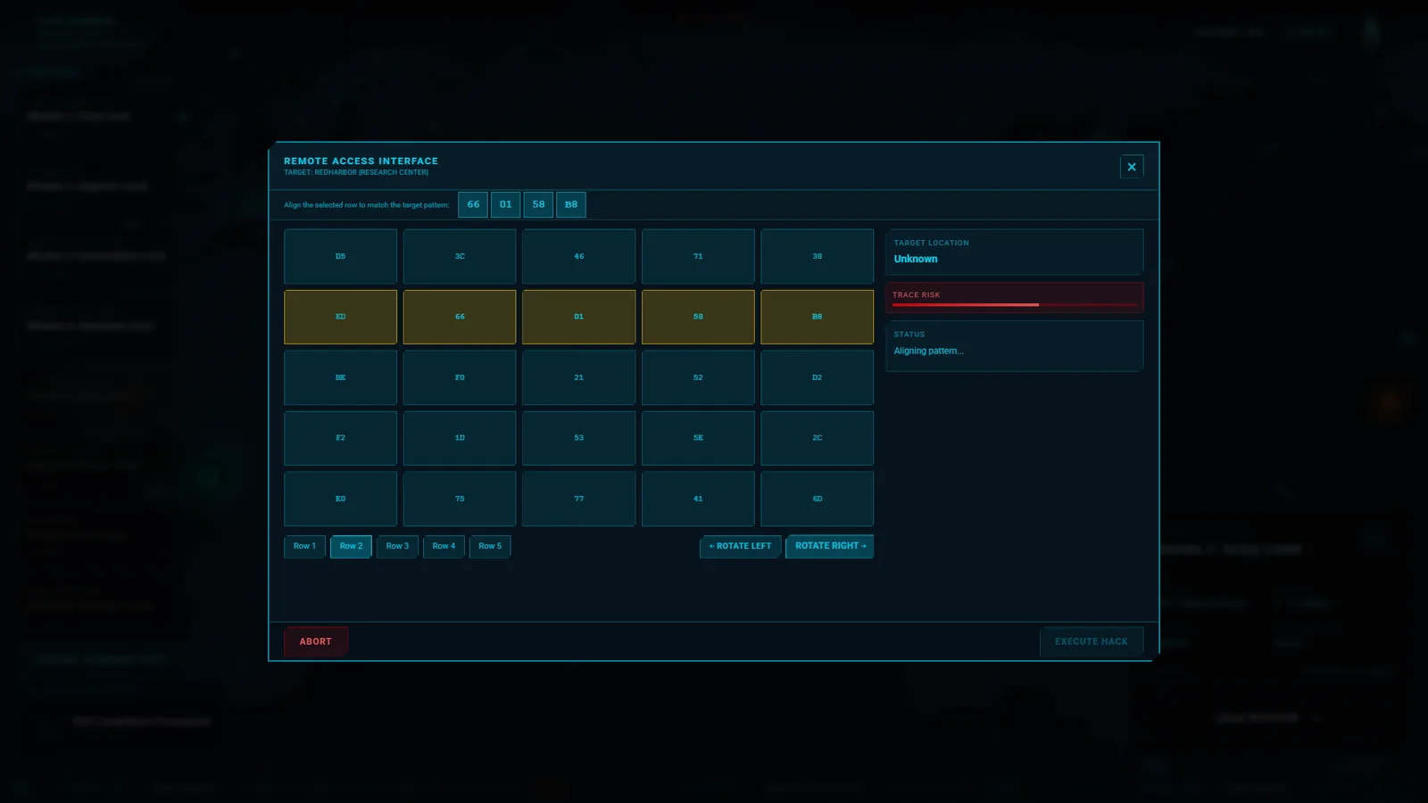
Minigame markers sit on the map beside mission markers, visually distinct.
Three quick interactions built into the world: a pattern-matching grid, a signal race, and a rhythm challenge with three difficulty levels.
Rewards are small by design, about 20 to 80 XP per win.
Design spec
GAME DESIGN 05 / DEBRIEF
Explain the score, or the score teaches nothing.
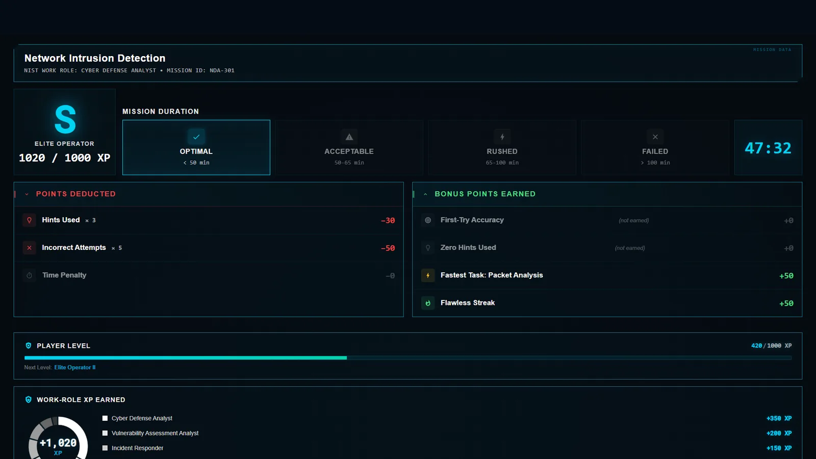
The debrief shows the grade and then accounts for it. Learners see what they lost and what they earned, in plain categories, with a clear way to try again.
A letter grade with four time bands, from optimal to failed.
Points deducted for hints, wrong attempts, and time. Bonus points for first-try accuracy, no hints, and streaks.
Three exits: leave, retry, or play the next mission. A fail still awards partial XP and points to review material.
More screens
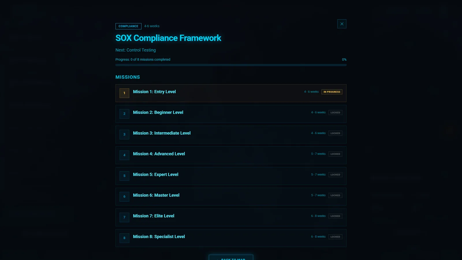
First-run welcome over the live mapTutorial spotlight on the start buttonThe start button in its loading stateConfirming a change of learning pathLearning path overview with eight missionsPlayer progression: XP, skills, quests, achievementsA global event card, expandedA live feed item expanded into detailsLevel-up modal with rewards (design spec)
WHAT I WOULD DO NEXT
It is a prototype, and I know where it stops.
Test the core claim. Can a new learner say what their next action is within ten seconds of landing? That is the number I would measure first.
Connect it to real data. Missions, progress, and events are sample data here. The path selector and the map need one shared source of truth.
Finish accessibility. The feed and results are keyboard and screen-reader ready. Map markers and panels are next, along with reduced motion across the whole screen.
Design for smaller screens. This version is desktop only. A tablet layout would start from the mission list, not the map.
UI / UX CASE STUDY
Product design: a first-time experience for a gamified cyber range.
Onboarding, learning paths, and mission entry. Portfolio examples use sample content and neutral branding.
The problem
How does a new learner get from choosing a training path to understanding, and starting, the next activity?
Design approach
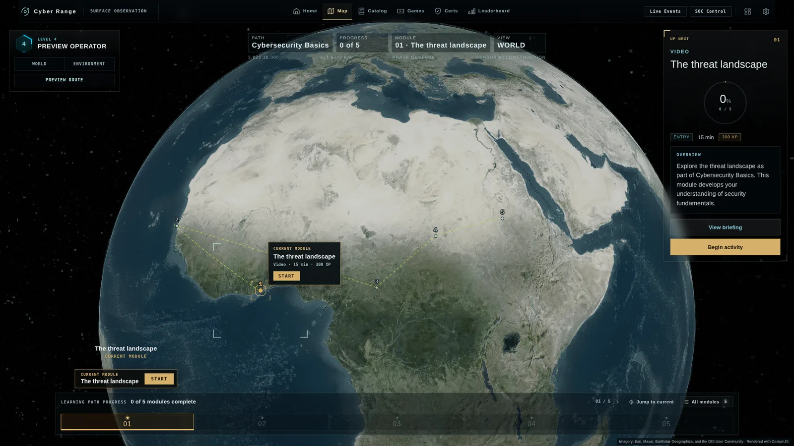
Learner flow, interface design, and interactive prototyping: compare onboarding directions, make module status clear, and connect the map to the briefing.
What to explore
Load the animated globe and zoom into a module location, then compare the path selection and onboarding flows. These are design prototypes with sample progress.
The learning path lives on the map, with the next module always one click away. Needs an internet connection for imagery · Open full screen ↗
Seven design directions
From a live globe and a world map to a direct-path SOC view, for military, enterprise, and friendlier audiences.
Fun is the easy part. Making it teach is the work.
Most “gamified” training is a quiz with points on top. I start from the skill and work outward. Every concept has to pass these eight rules before anything gets built.
Start from the job, not the game
Before any mechanic or art: which role is this for, which skill does it drill, and what should someone do better after ten sessions? If I cannot answer in a sentence, it is entertainment, not training.
One skill per game
A game that teaches ports, protocols, and firewall rules at once teaches none of them. Each game isolates a single skill so the score means something.
The knowledge is the controller
You cannot win by reflexes or by clicking fast. The only way to act in the game is to use the skill, so the mechanic falls apart for anyone who does not know the material.
Recall beats recognition
Picking from four options is recognition. Typing the pattern, placing the card, or drawing the route is recall, and recall is what holds up on the job.
Feedback teaches while you play
A wrong move explains itself on the spot, in the game, in under a second. Nobody waits for an end screen to find out what they got wrong.
Harder means deeper, not faster
Later rounds add ambiguity, exceptions, and trade-offs. Speeding up the clock only tests typing.
Score accuracy first
Speed is a capped bonus. Missing a real threat costs more than a false alarm, the same way it does in a SOC.
Five minutes, worth replaying
Short enough for a coffee break, with content that reshuffles every run so a learner cannot memorize the answers.
WHAT IT DOES FOR LEARNERS
Training people open, finish, and come back to.
These are the design goals each game is built toward. They are intentions I design for, not measured results.
They start
A five-minute game with one clear goal is easier to open than a forty-minute module. The first action happens in seconds, not after three screens of reading.
They practice, not just read
Every round is retrieval practice: the learner has to produce the answer and act on it. That is the part passive content skips.
They find out why
Feedback lands on the decision that caused it, so a mistake turns into the next correct move instead of a red mark at the end.
They come back
Fresh content each run and a score to beat give people a reason to replay, and repetition spread over days is what makes a skill stick.
You can see it
The games are built to report score and completion to the host platform, so an instructor sees who has the skill and who needs help.
WHAT I BRING TO YOUR TEAM
A designer who already knows your product, your learner, and your stack.
Most designers need six months to learn what a cyber range is. I have designed the learner journey for one, built eight training games of my own, and I can build what I design.
20 yearsin games and product design
8 gamesdesigned and built, playable from briefing to debrief
Design → buildfrom strategy through implementation
209 testsproving the learning rules of every game
Learner experience
Onboarding, learning paths, mission briefings, objectives, feedback, and debriefs. The whole route from first login to first completed activity.
Gamification that teaches
Minigames, progression, and scoring that drill a real skill, designed against a written gate so fun never replaces learning.
Security framework literacy
I work in your content team’s vocabulary: MITRE ATT&CK, the Cyber Kill Chain, and NICE work roles. My games are built so each scenario can be mapped to them.
Dense, expert interfaces
Game HUD experience applied to consoles, maps, and dashboards: clear hierarchy, readable status, and keyboard-first interaction.
Design systems
Component libraries and UI standards that let a team scale screens and content without losing consistency. I ran UX standards across nine studios at once.
Front-end build
React, TypeScript, Next.js, Phaser, and Three.js on the web. UMG and CommonUI in Unreal Engine. Prototypes your engineers can read, or production UI.
MY FIRST 90 DAYS
What you would get, in order.
Days 1 to 30 · Learn and auditWalk the product as a new learner and as an instructor. Map where people stall, and agree with product and content on the three fixes that matter most.
Days 31 to 60 · Ship one flow, prototype one gameRedesign the highest-impact flow through to a testable build, and take one learning objective from concept to a playable prototype.
Days 61 to 90 · Make it repeatableTurn what worked into components, patterns, and a game design checklist the team can use without me in the room.
Roles I fit
Senior or Principal Product Designer, UX / UI Lead, learning experience or game designer for training, and hybrid designer-developer roles.
How I work
Daily with engineers and producers, early with content developers and subject experts, and in code when a prototype answers the question faster than a meeting.
Background
Disney, Sony, Riot Games, Tencent, Twitch, and AppLovin on the game side. Consulting on mission-critical products for high-security clients since 2025.
I am open to full-time and contract roles, remote from Greater Montreal. I can walk you through any game or flow on this page, the decisions behind it, and how I would approach your product.